
GOFUNDME
Insight-driven and efficiency design upgrades for organizers editing and managing their fundraisers.
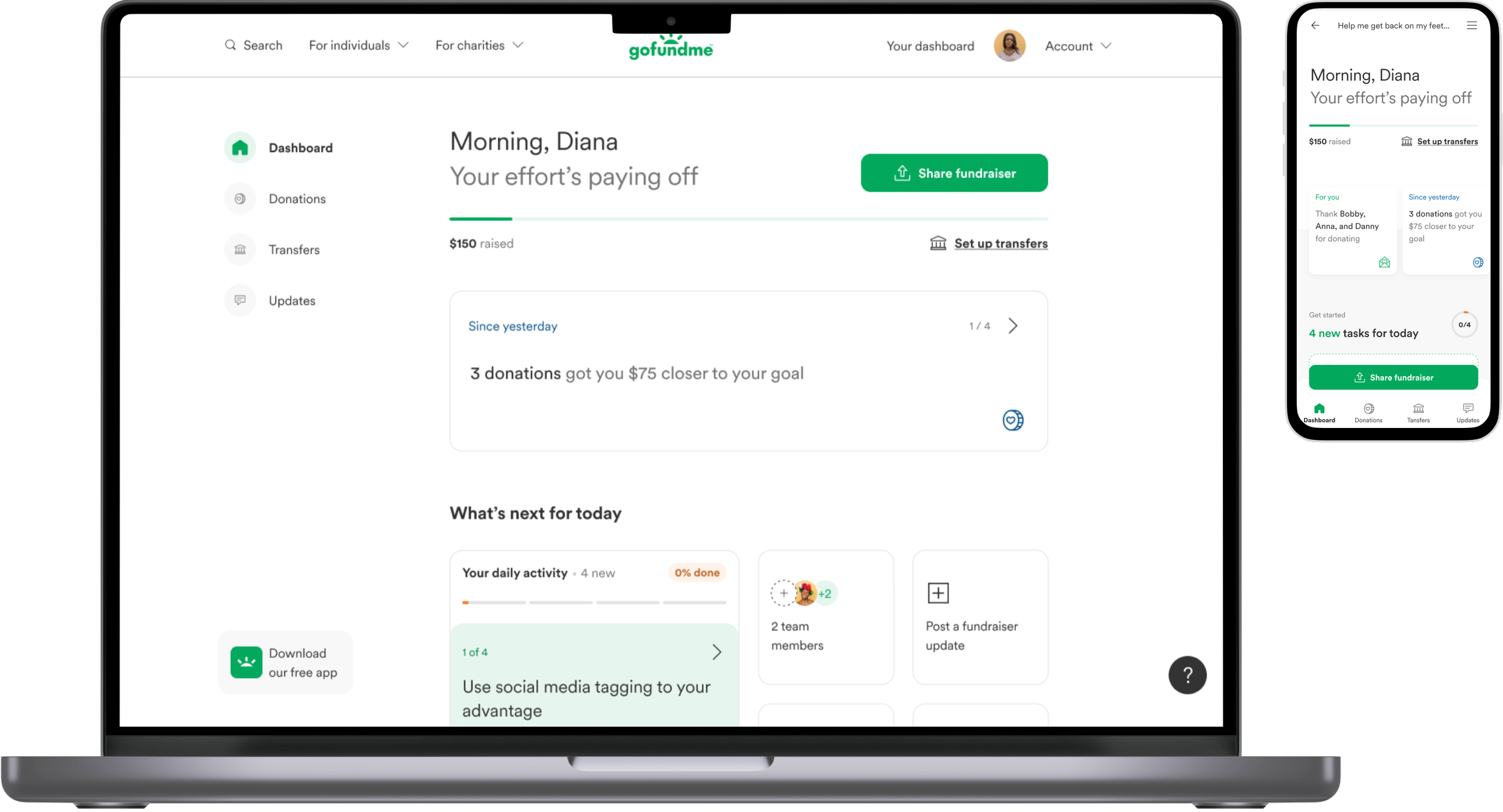
Manage dashboard
TIMELINE
3 months
ROLE & SKILLS
information architecture ; journey mapping
PARTNERS
1 product designer ; 1 product manager
Our Goal
Build a more insightful, guided, and design system aligned dashboard for organizers to effectively and efficiently manage their fundraisers—from editing story, posting updates, and thanking donors to understanding their latest fundraiser activity and taking appropriate action to get more donations
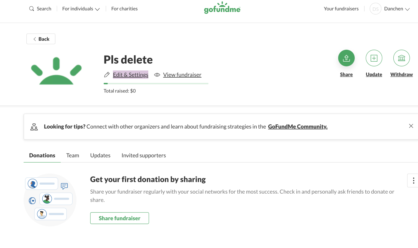
Previous manage dashboard
The Approach
The metrics we wanted to drive were an increase in engagement by measuring…
Dashboard visits
Sharing
Thanking
Updating
Creating a team and adding team members
New active users
…to also eventually improve yield:
Number of organizers reaching 2 or 6 donations (NAC 2/NAC 6)
Average gross donation volume + number of donations

Current dashboard engagement - drop after day 1 of fundraiser creation

The conversation rate of NAC 6 increases substantially when organizers engage with manage features
To anchor our features and designs, I created a comprehensive list of content and design principles to guide our priorities and content and design execution:
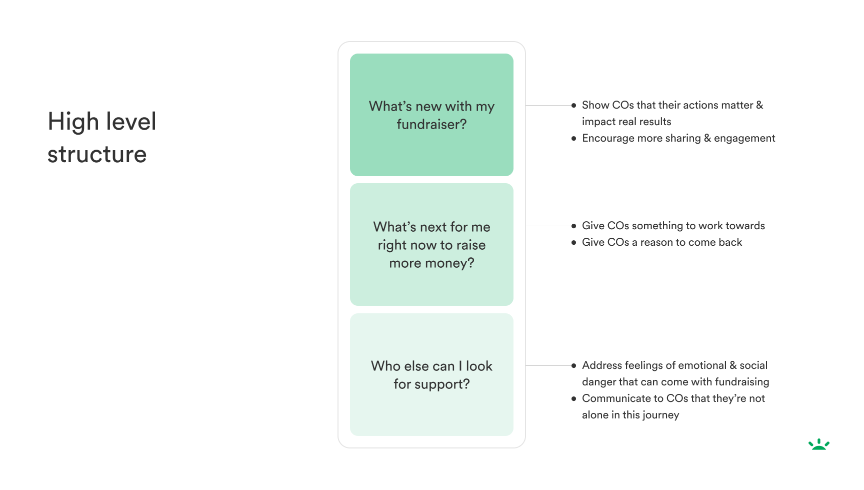
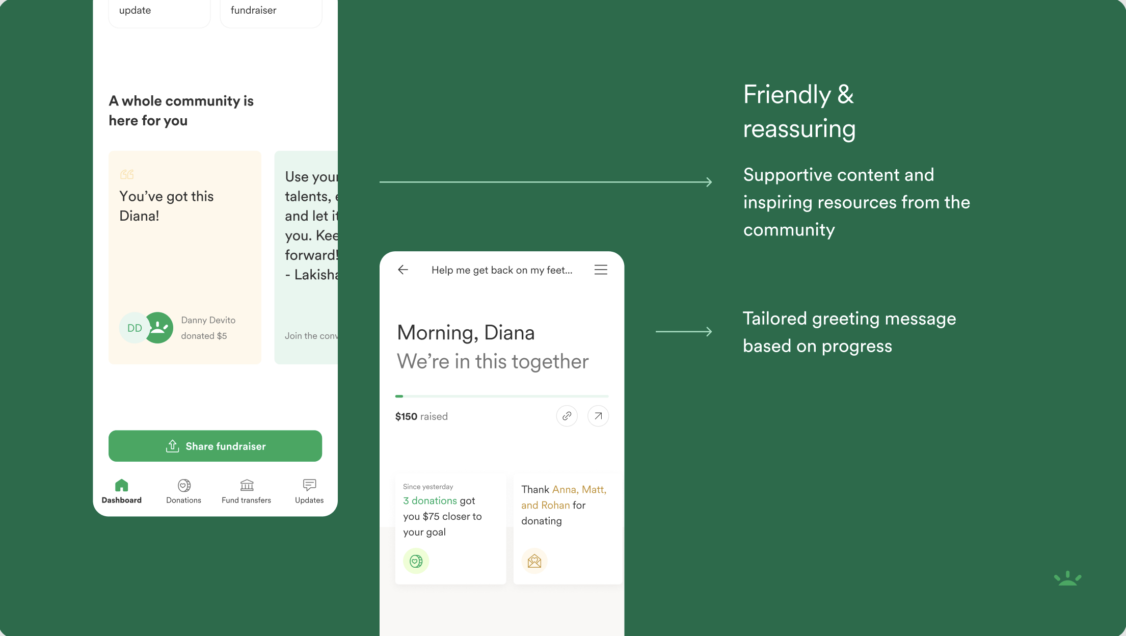
Tailored help at every step
From types of guidance and next steps to our welcome messaging, we want to meet our users where they are in their journey. That way, managing their fundraiser feels relevant and fresh at any and every point in their journey.Action-oriented insights
From new donations to goal progress tracking week by week and day by day, we want to reward organizers throughout their fundraising journey. Instant, data-driven milestones can make users feel their progress and empowered to make more informed fundraising decisions.Community support in one place
We’re centralizing the power of community form fundraiser comments, advice from other organizers, and educational resources to continue building GoFundMe as the most helpful place.
Process
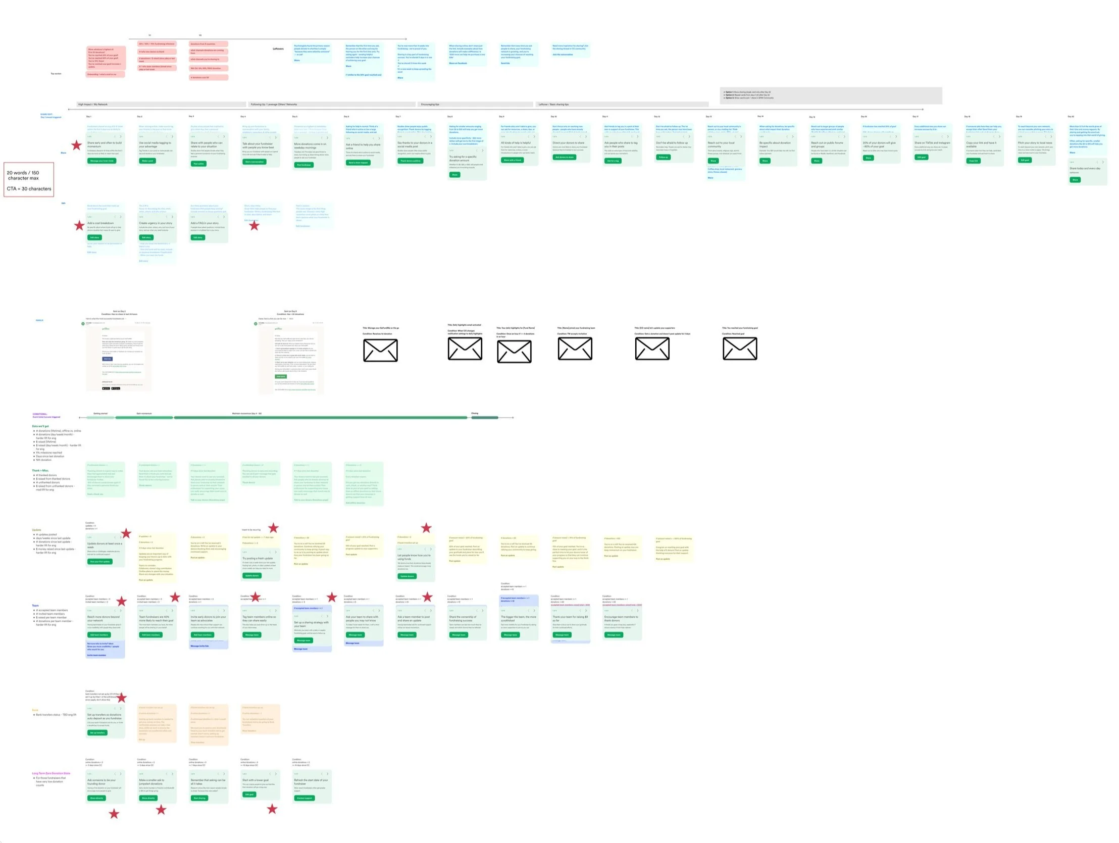
Together with my intern, we created a “daily tasks'“ anatomy to help guide content execution which included goal/value, additional info, and a call to action—all mapped in order of:
Highest impact (sharing, leveraging your network)
Following up and leveraging other networks
Encouraging tips
Basic sharing tips
This brainstorming space also enabled us to prioritize which tasks would go into the phase 1 launch of the dashboard across all features (sharing, editing, thanking, updating, creating a team, managing transfers, and a long term zero donation state).
We started by creating a high level structure of what we wanted the manage dashboard to look like.
Outputs
Highlights of the new experience


Prototypes
Deeper dive into insights they can take action on right below their fundraising goal bar and customizations depending on whether the organizers has raised funds under the “No donations yet” page and the “Yes some donations” page respectively as well as progress on their daily tasks.
The other pages are interaction and display explorations for the daily tasks section.
Edit & Settings
We were also able to update the edit & settings experience as a whole to better align with these updates as well as reduce help center tickets with questions.
Before
After

